
Bachelor’s Thesis - Summa Cum Laude, 10/10. Awarded with special distinction by UAB.
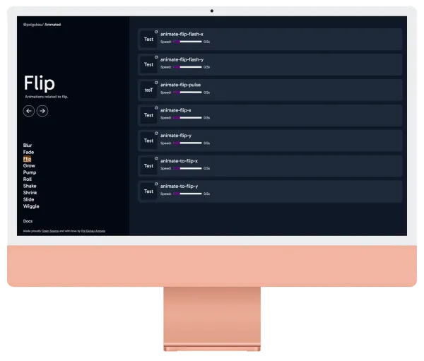
Pol-UI is a React component library I built as my final university project. What started as a thesis requirement became a production-grade library with 150+ components, a full documentation site, Storybook integration, and 50,000+ NPM downloads.
Why I built it
During my third year at university, I was already working full-time at Mesalvo building design systems. I saw the same patterns repeated across every project - buttons, modals, forms, tooltips - all built from scratch each time.
I wanted to build something reusable, well-documented, and actually pleasant to use. Not another component dump - a coherent library with a consistent API and real accessibility support. I wrote about the full process - including the mistakes - in What I learned building a UI library from scratch.
What’s inside
Pol-UI ships with:
- 150+ components - from primitives (Button, Input, Badge) to complex patterns (DataTable, CommandMenu, Combobox)
- Full TypeScript support - every prop typed, no
anyescapes - Radix UI primitives - accessible by default, keyboard navigable, screen reader friendly
- Tailwind CSS - fully customizable via tokens, no style overriding hacks
- Storybook - every component documented with live examples
- Vitest + Testing Library - >80% test coverage
npm install pol-uiimport { Button, Input, Modal } from 'pol-ui';
export function LoginForm() {
return (
<form>
<Input label="Email" type="email" />
<Input label="Password" type="password" />
<Button intent="primary" type="submit">Sign in</Button>
</form>
);
}Technical decisions
Why Radix UI? Accessibility is hard to get right. Radix handles focus management, ARIA attributes, and keyboard interactions so I don’t have to.
Why Tailwind? Design tokens via CSS variables + Tailwind utilities means consumers can theme the library without fighting specificity wars.
Why Vitest over Jest? Faster. Native ESM support. Same API. No config needed with Vite.
The documentation site
The docs at ui.polgubau.com cover every component with:
- Live interactive demos
- All prop variations with TypeScript types
- Accessibility notes
- Copy-paste code examples
Documentation took nearly as long as the library itself. I think that’s correct.
Impact
- 50,000+ downloads on NPM since launch
- Used in multiple freelance projects and Doscientos client work
- Referenced in my thesis paper which received a special distinction from UAB
The full source is on GitHub. Contributions welcome.
The component composition patterns I developed for this library are explained in detail in React Component Composition Patterns.
Links