React Beauty Flags
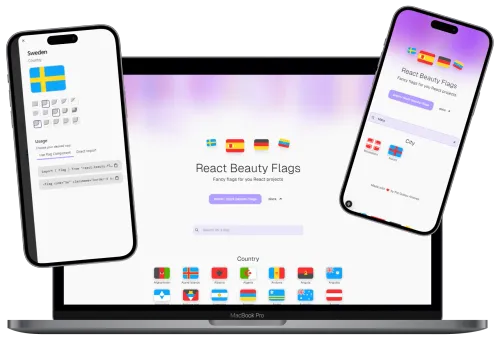
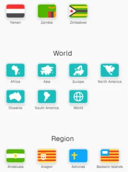
React Beauty Flags is a React library that provides over 250 handcrafted SVG flags — from countries to cities — designed to bring color and style to modern interfaces.
Born from frustration with dull or over-complicated alternatives, it focuses on simplicity, visual harmony, and developer experience.

Motivation
After reusing flags in dozens of projects, I realized existing solutions were either too heavy or lacked design consistency. Inspired by Duolingo’s clean and playful visuals, I decided to design a set that looked great in any modern UI while staying developer-friendly.
“I wanted something elegant enough for portfolios but simple enough to drop into production.”
The result is a library now downloaded over 1,000 times (and growing!) through NPM, with strong adoption among UI-focused developers and open-source enthusiasts.
Highlights
- +250 Handmade Flags — Countries, cities, and symbols designed in Figma.
- Lightweight & Fast — Zero external dependencies, optimized SVGs.
- Customizable — Supports Tailwind utilities for borders, shadows, and radius.
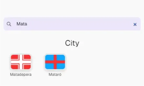
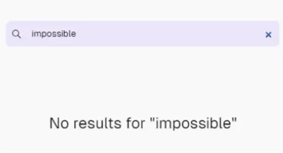
- Search & Filter — Built-in search experience with sharable URLs.
- TypeScript Ready — Fully typed, autocompletion in your IDE.
Technical Details
For developers & curious minds
🧰 Tech Stack
| Tool | Purpose |
|---|---|
| React | Core library for rendering components |
| TypeScript | Static typing and code reliability |
| Tailwind CSS | Utility-first styling for the demo website |
| Figma API | Fetch and sync vector flag designs |
| svgo | SVG optimization for fast loading |
| GitHub Actions | CI/CD automation for build and NPM publish |
🗂️ Library Structure
├── src
│   ├── components/   # Flag components
│   ├── data/         # Flag metadata and enums
│   ├── scripts/      # Automation scripts (get-figma, build-flags, check-flags)
│   └── index.ts      # Export entry
├── website/          # Next.js showcase website
├── .github/workflows # CI/CD pipelines
└── package.json
⚙️ Automation Scripts
get-figma.ts — Fetches SVGs from Figma via API and stores them locally.
const response = await fetch(`${FIGMA_API_BASE}/files/${fileKey}`, {
  headers: { 'X-Figma-Token': FIGMA_API_TOKEN! },
});

const flagsPage = fileData.document.children.find(
  (page: any) => page.name === 'Flags' && page.type === 'CANVAS'
);
build-flags.ts — Optimizes SVGs with svgo, generates React components and enums.
check-flags.ts — Validates flag consistency and missing metadata.
🚀 CI/CD Workflow
Every push to main triggers GitHub Actions to:
- Fetch latest Figma flags
- Build & optimize assets
- Publish a new package version to NPM
- Deploy the demo site to Vercel automatically
This workflow ensures the library is always up-to-date and deploys in under 2 minutes.
Website Overview
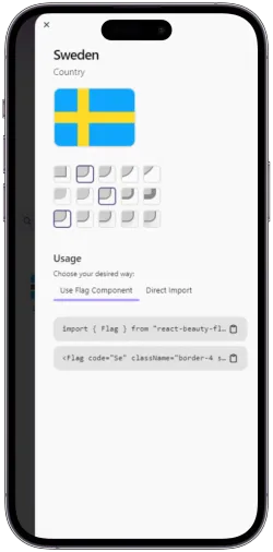
The official website — built with Next.js and TailwindCSS — showcases all flags with live filtering, previews, and instant code copy. Each flag includes:
- Interactive customization (radius, border, shadow)
- Copy-to-clipboard with prebuilt Tailwind classes
- Deep-linking via URL for easy sharing
Lessons & Impact
Building React Beauty Flags reinforced my interest in developer tooling and DX-first design. Automating asset pipelines with TypeScript and Figma APIs improved my workflow, saving over 10 hours of manual flag updates per release.
The project also sparked collaborations from other developers, who contributed designs and new scripts.
Small details make software delightful — and flags, surprisingly, are one of them.
Future Plans
- Add world organization and event flags
- Extend utility functions (color palettes, code matching)
- Add analytics on flag usage
- Improve accessibility metadata
