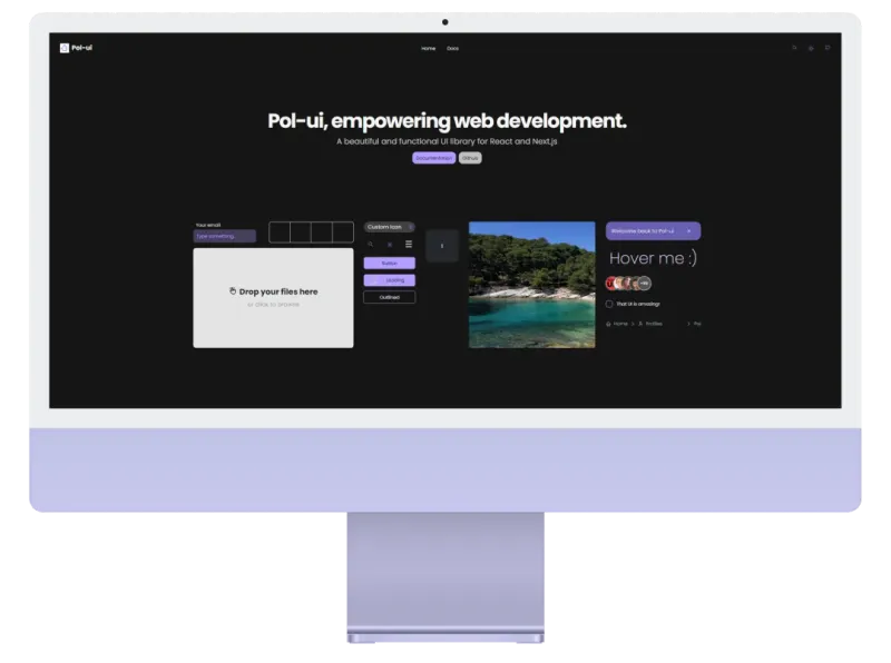
My Bachelor’s thesis was a React UI library. 150+ components, a documentation site, Storybook, unit tests, and a 100-page written paper - all while working full time at Mesalvo.
It got a 10/10 and a special distinction from the university. It also taught me more than any job ever has.
Here’s what I actually learned - not the theoretical stuff, the things that cost me real time.
The API is the product
I spent the first month building components. Then I showed them to a friend and watched him struggle to figure out how to use a simple Button.
That’s when I understood: the component API is more important than the component implementation.
A Button with 20 props is harder to use than a Button with 3, even if the 20-prop version is technically more powerful. Complexity hides in interfaces.
I rebuilt the API three times before it felt obvious. Each rebuild made the code more complex internally and simpler externally. That’s the right tradeoff.
// Version 1 - too much
<Button variant="filled" size="md" rounded="full" shadow="lg" ripple={true}>

// Version 3 - just right
<Button intent="primary">
Tokens first, components second
I made the mistake of building components before defining design tokens. Halfway through, I needed to change the primary color across 80 components.
It took three days.
After that, I built a proper token system - spacing, colors, radii, shadows - and ran everything through CSS variables. Changing the primary color after that took 30 seconds.
Design tokens aren’t just for big teams. They’re the foundation that makes everything else maintainable.
Documentation or it doesn’t exist
Pol-UI has a full documentation site at ui.polgubau.com. Building it took almost as long as building the library itself.
People don’t read README files. They open the docs site, scan for an example close to their use case, copy it, and move on. So that’s what the docs need to support: quick scanning, real examples, and code you can copy without modification.
Every component page has: a live demo, the simplest possible usage, all prop variations, and accessibility notes. In that order.
Testing is not optional
I skipped tests for the first two months. Then I refactored the modal component and broke four other components that depended on it without realizing.
I added Vitest + Testing Library after that. Writing tests for UI is annoying at first, but the feedback loop becomes invaluable once the library grows past ~30 components.
For accessibility specifically, I used Axe - it catches things you’d never find manually, especially focus management and ARIA attribute misuse.
The version number is a promise
Every time I published a patch and something broke, I lost a bit of the trust I was building. Semantic versioning isn’t bureaucracy - it’s a contract with your users.
Now I follow it strictly: bugfixes in patch, new features in minor, breaking changes in major. And breaking changes have migration guides.
Building a library is one of the best learning exercises I can recommend. It forces you to think from the consumer’s perspective, which makes you a better developer everywhere else too.
Pol-UI is open source on GitHub and live at ui.polgubau.com if you want to see how it turned out. You can also read more about the Pol-UI project and the design decisions behind it.
If you want to go deeper on how component APIs scale, I also wrote about React composition patterns - the techniques I wish I had known before building this library.
Related Articles
React Component Composition Patterns: Compound Components, Render Props & More
Master React component composition patterns with real-world examples. Learn compound components, render props, slots, and context patterns. Reduce props, increase flexibility, and build better design systems.
Modern CSS Features 2026: Container Queries, :has(), Cascade Layers & More
Complete guide to modern CSS features in 2026. Learn container queries, :has() selector, cascade layers, subgrid, OKLCH colors, and view transitions. Practical examples with browser support info.
React 19 New Features: Actions, use Hook, and Migration Guide
Complete React 19 guide covering new features: Actions API, use hook, document metadata, ref as prop, and more. Includes migration tips, breaking changes, and real-world examples from production apps.